Magazine Anaysis
 Name of Magazine and specific genre/sub-genre:
CYCLING PLUS
sport
Cost, frequency, and supposed target:
£4.99
Annual frequency - 13 issues per year
Target audience is for adults interested in sport and cycling more aimed at middle class men
Aesthetic, style, and major design decisions:
Colourful images and bold text in boxes making things stand out. Regular design magazine with mastheads, subheadings, photos, and columns and blocks of text.
Lexis, language, and mode of address:
Strong positive language used to entice people into the magazine and make people more interested in cycling. The use of alliteration on the front page "ride your heart healthy" is catchy and anyone interested in there health will probably look at this and want to read the article.
Direct language making the audience feel like they are aiming this right at you. For example "Eat yourself faster", "Nail your first ride",
Key article:
This Double page spread 1 main photos which spreads across the 2 pages. There is also some text which is over the top of the photo. Main big size masthead saying "Go the Distance". Small text underneath but not much. This page is mainly to grab the attention of the reader, as there is not much to read. The photo is focused on the 3 men cycling who are in 1/3rd of the image creating the rule of thirds composition.
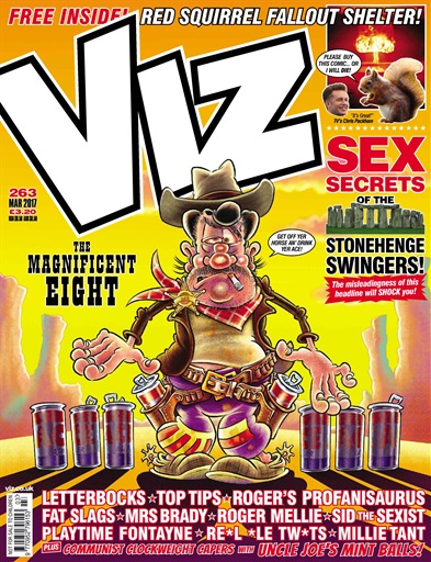
Name: VIZ, it is supposed to be a more comedic magazine. Not serious at all.
Cost and target audience: costs £3.20. The target audience is the younger generation of the working-class. with younger working-class adults being targeted too.
Aesthetics: The front cover is deliberately crude with a man dressed as a cowboy with a cigarette in his mouth however, instead of guns being in the mans holsters, there are cans of beer. This is something that majority of the working-class can relate to as beer is not seen as a high class drink. The man also looks quite untidy as seen with the way he is presented. There is also frequent use of bad language with the second biggest title being "SEX SECRETS". The main colours on the front page are red, yellow and orange.
 Lexis, language and mode of address: There is a constant use of profanities. Has a and direct informal mode of address consistently. "Get off yer horse..." The language used is also very simplistic yet very crude further reinforcing the fact that this magazine is aimed at the working-class. The constant abbreviations of words such as "An'", "Wot","Im" etc show that the target audience already understands all of the magazines codes and conventions.
Key Article: The key article in this magazine is the one about Stonehenge. The article purposely over-exaggerates the news and claims to have exclusive information saying soon, the visitors wont be able to even look at the site to protect it. This shows the ideological perspective of the producer as he must think that the government is trying to protect sites and impose laws that make no sense at all and because of this perspective has fabricated this article however, because it was published in a comedic magazine targeting the working class they can get away with it as it can be said that the article is just for entertainment purposes.
Key representation: The key representation in this magazine is that men are better then women. The whole magazine is extremely sexist and offensive with women being described as "Fat Slags". This was even the title of a comic and the title was put on the front page. The magazine also portrays women as the root of problems. All of the sexism is explicit and is even featured in titles of comics as seen with the comic of Sid The Sexist etc.
Production values and their relation to the target audience: The production of the magazine is very low with articles all cluttered together with the constant magazines. The constant rude mode of address and slang used appeals to the target audience of the younger generation of the working class.


Comments
Post a Comment